This text-based explainer video illustrates three design tips for non-designers that could assist in producing professional looking digital projects. The video aims to introduce the target audience to the basic tips in typography, such as the use of fonts, and the grid system. As a learning designer, I do understand the value that good design aids in attracting and holding learner’s attention. Poor use of typography affects the legibility readability of the text (Craig & Scala, 2006). So, I believe that my fellow learning designers deserve to have these tips to help them enhance the message that they are presenting.
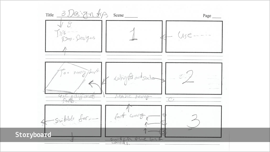
Tip 1
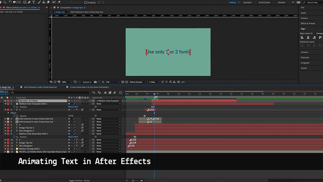
Use 1 or 2 fonts
Too many fonts distract the user from your message
Instead, explore different weights and scale
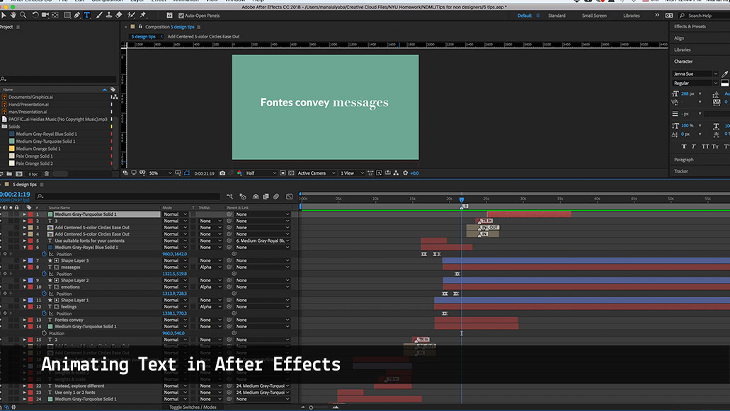
Tip 2
Use suitable fonts for your contents
Fonts convey feelings, emotions, and messages
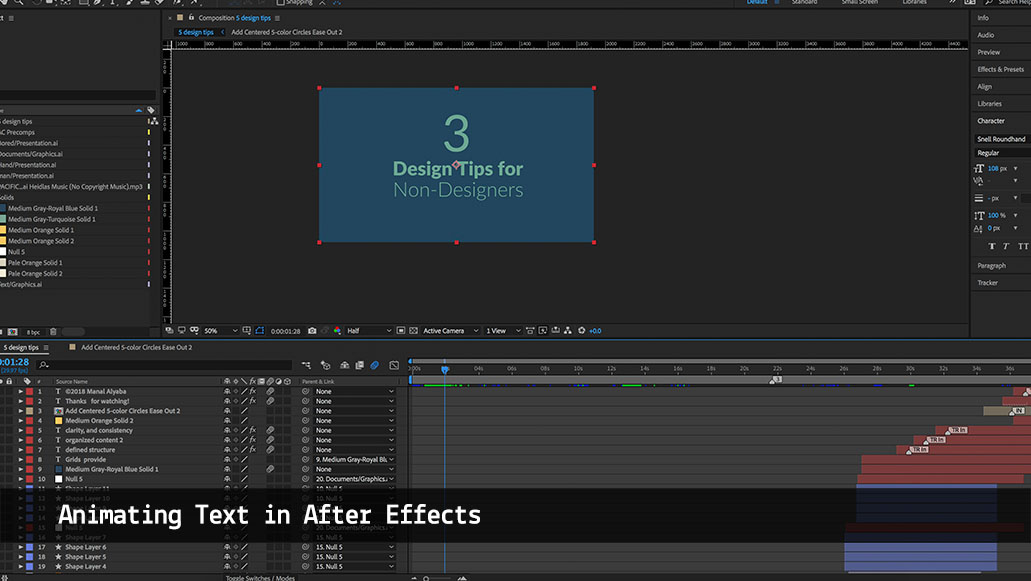
Tip 3
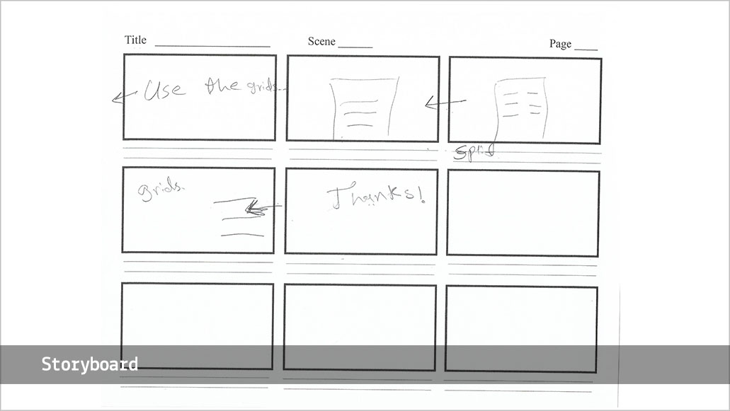
Use the Grid System
The grid system provides a defined structure, organized content, clarity,
and consistency
Profinissanls who are producing digital projects, but are unfamiliar with the basic visual design skills
Age 23 and up
English speakers
After watching this motion graphic piece audience will:
. develop a basic understanding of typography rules
. be able to apply the common rules of graphic design
Scaffolding: as scaffolds are the tools, strategies, and the guides that support learners in achieving a higher level of understanding(Sherin, Reiser, and Edelson 2004), this explainer video provides the learners with the basic information of a successful design. The video clearly states what the learners need to know, and why they need to use these tips.
Dual coding system: although this video is a text-based which is targeting the verbal channel, it is also combined with simple visual materials and animation to represent the text. For example, when the grid is mentioned there is a visual animation to explain the grid, also when talking about the weight the text was very bold, and the scale was represented by enlarging the text.
Problem-solving: this explainer video focuses on addressing a problem that potentially affects the learning experience of the users. So by using these tips learning designers can provide solutions that reduce the distractions that occur as a result of poorly designed academic materials.
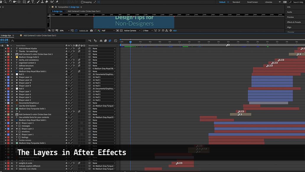
I started by brainstorming the concept that I wanted to design. From talking to some of my classmates I got the inspiration to do this project. Originally I had five design tips that I wanted to talk about in this video, but due to the time limitation, I picked the main three ones to explain.
The second step was creating a storyboard for the idea and the animation style that I wanted to use.
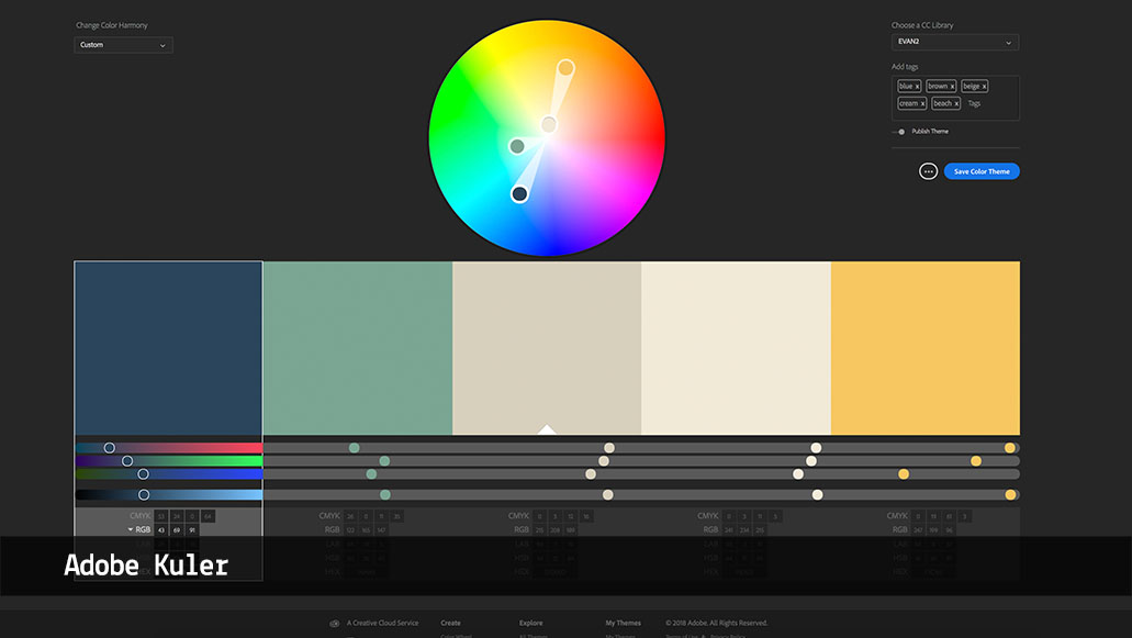
I have used Adobe Kuler to pick my color choice, which I started with tinted two primary colors yellow and blue.
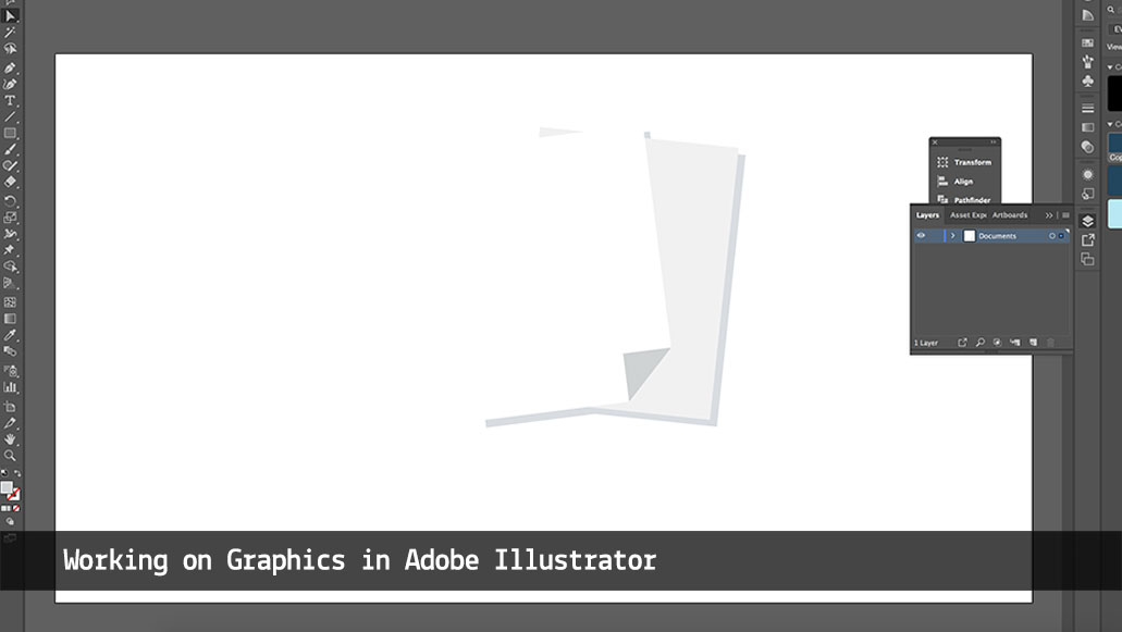
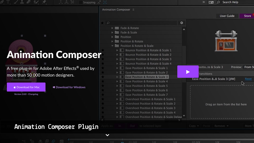
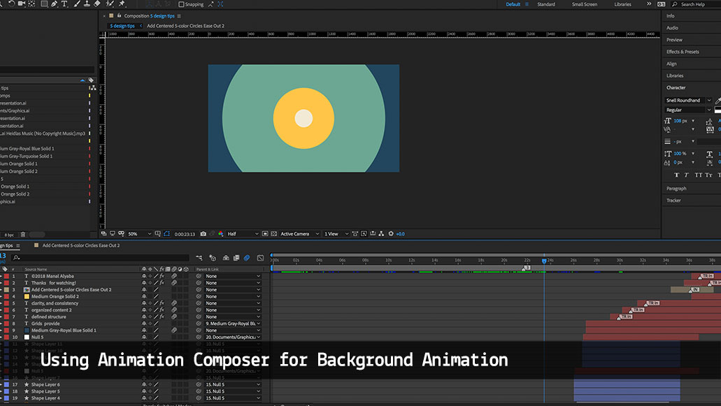
I have used Adobe After Effects, and Animation Composer plugin that creates faster animations, and also Adobe Illustrator for creating the graphics.
I have decided to use Leto fonts due to its different weights variety. Plus I added a few different fonts just to explain how fonts would affect the legibility of design.
If the time allows, I would love to have voice over to explain the design tips while I show a clear visual design, also I would slow down the video a little bit as I believe some parts of the video are fast for some learners.
Programs: Adobe After Effects, Adobe Illustrator
Category: Motion Graphics
Created: Fall 2018
Scaffolding Analysis: Extending the Scaffolding Metaphor to Learning Artifacts Bruce Sherin, Brian J. Reiser, and Daniel Edelson, The Journal of the Learning Sciences, Vol. 13, No. 3, Scaffolding (2004), pp. 387-421.
Clark, J. M., & Paivio, A. (1991). [Dual coding theory and education] . Educational Psychology Review, 3(3), 149–177.
Designing with Type, 5th Edition: The Essential Guide to Typography, James Craig, Irene Korol Scala, Potter/Ten Speed/Harmony/Rodale, 2012.
Written, Designed & Animated by Manal Alyaba
Music by PACIFIC SUN by Nicolai Heidlas Music https://soundcloud.com/nicolai-heidlas Creative Commons Unported CC BY 3.0